ENSO Energy
Packaging Design, Sales Materials
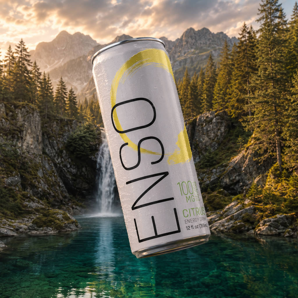
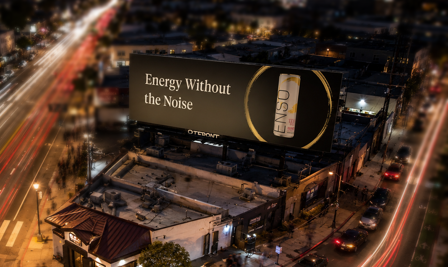
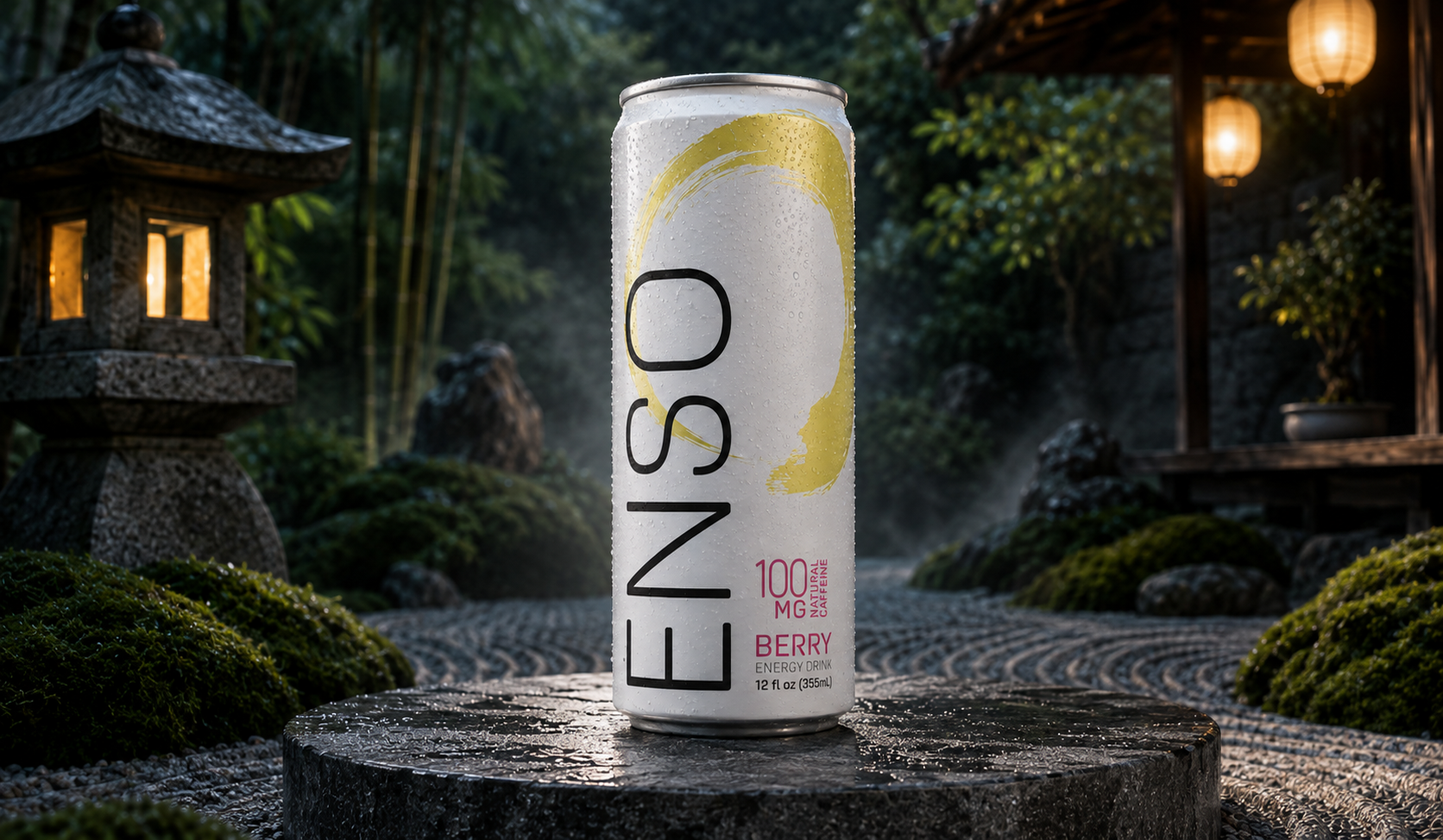
ENSO is a functional energy drink brand created around a more refined approach to energy. Rooted in the symbolism of the Japanese Enso circle, the brand brings together balance, clarity, and focused strength for people who want energy without the noise and intensity traditionally associated with the category.
Mission
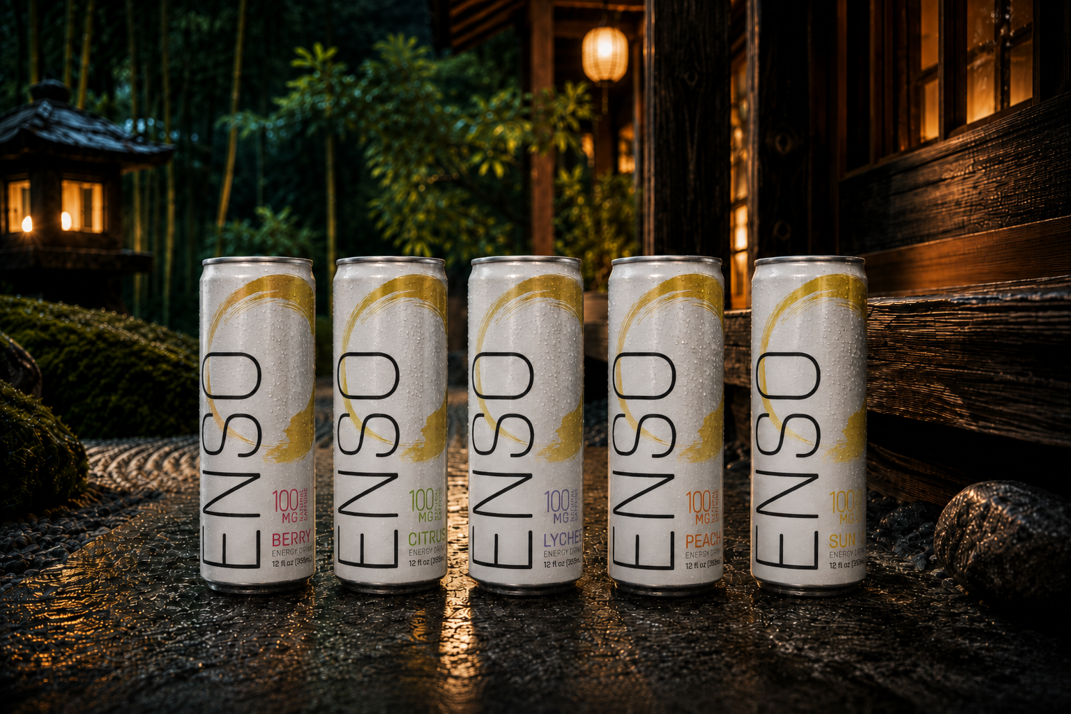
The goal was to develop a packaging system that could communicate both energy and restraint. The challenge was to stand apart from a category dominated by aggressive graphics, bright colors, and high-intensity messaging while still feeling unmistakably like an energy drink. The packaging needed to express ENSO's philosophy of balance and focused strength, create strong shelf presence, and establish a flexible visual system that could grow across flavors.
Solution & Process
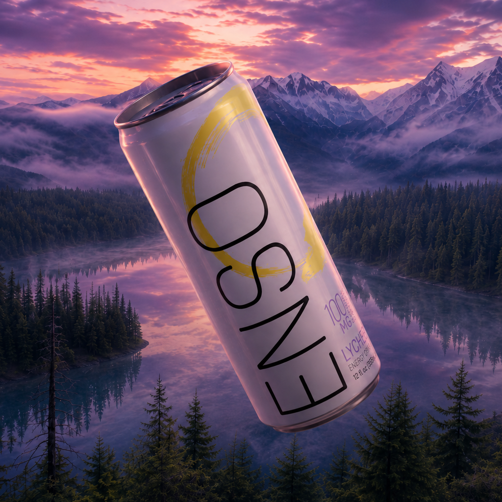
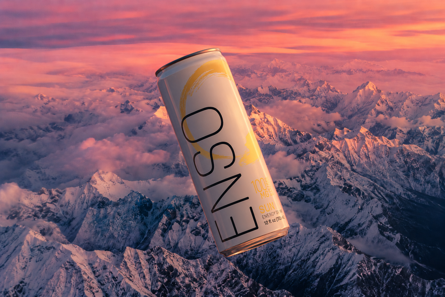
We built the packaging around contrast: a minimal structure, confident typography, and the expressive Enso circle as a defining visual element. Rather than competing with the visual noise of the energy category, the design uses restraint to create impact, pairing a refined layout with bold graphic gestures and flavor-specific color to build recognition across the line. Every element was designed to feel modern, premium, and energetic without becoming aggressive. The result is a distinctive packaging system that reflects ENSO's idea of focused energy and mindful strength while giving the brand a confident presence on shelf.